Google Pay Logo Redesigned
For my module in Design Principles, I redesigned the logo of Google Pay. In here, I document about more about my thought and design process behind the final product.
About this Project
This project was an assignment given in Year 1 Semester 1 for the project Design Principles. For this assignment, we were tasked with the goal of redesigning a logo. Thus I set out to do my research on logos that I felt were vague and could be better, eventually settling on Google Pay as I felt that the logo was a little too ambiguous and could convey a stronger meaning while fitting it within the google app ecosystem.
To recreate the ‘Google’ look, I first had to identify what features google application logos have that makes them look GOOGLE. 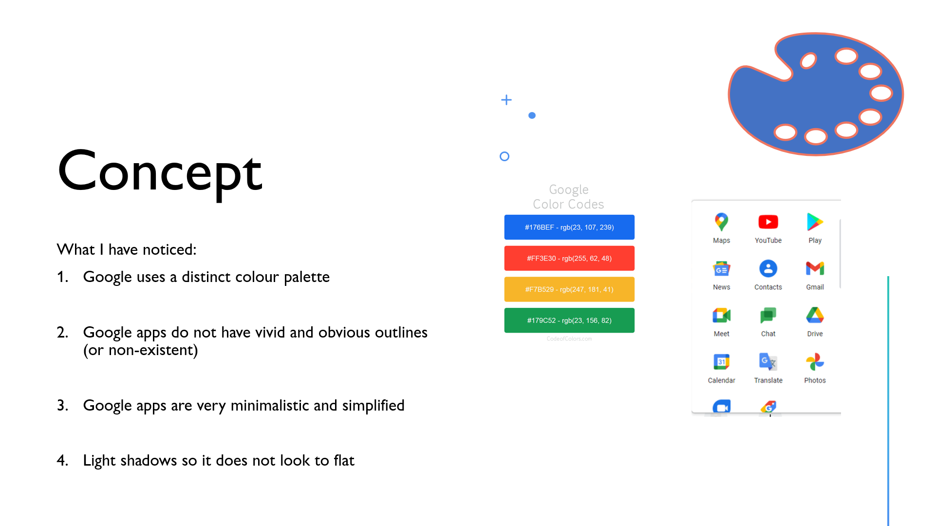 A study on what makes google logos distinct
Based on what I have studied, they all embody the following characteristics: a simplistic design, follows the same Google colour palette, no vivid outlines and light shadows to convey some level of depth. So using these key features I drafted different ideas around the idea of a ‘wallet’ and added some details to the final draft before going into Adobe Illustrator to create the final product.
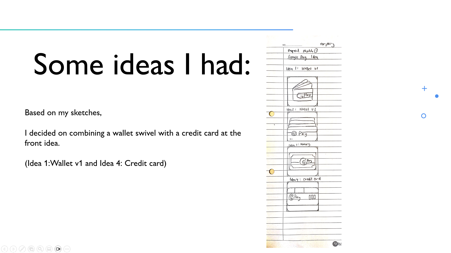 My first draft on ideal concepts, brainstorming stage
Finally, with Adobe Illustrator I designed the Google Pay Logo to one that resembled more of a wallet with some accents to depict a credit card in front while keeping the same characteristics of Google apps, so it looks just like an originally created. 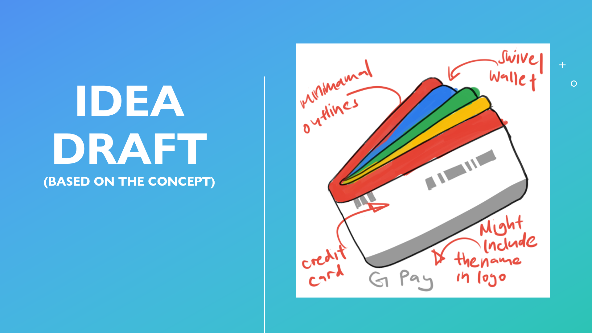 My final concept draft of the Google Pay logo
Roles and Contributions
For this project I handled all processes myself from ideation to research and final product.
My Take on this Project
When I finished the project, I was quite proud of the final result as it was exactly what I had envisioned it to look like from the beginning. 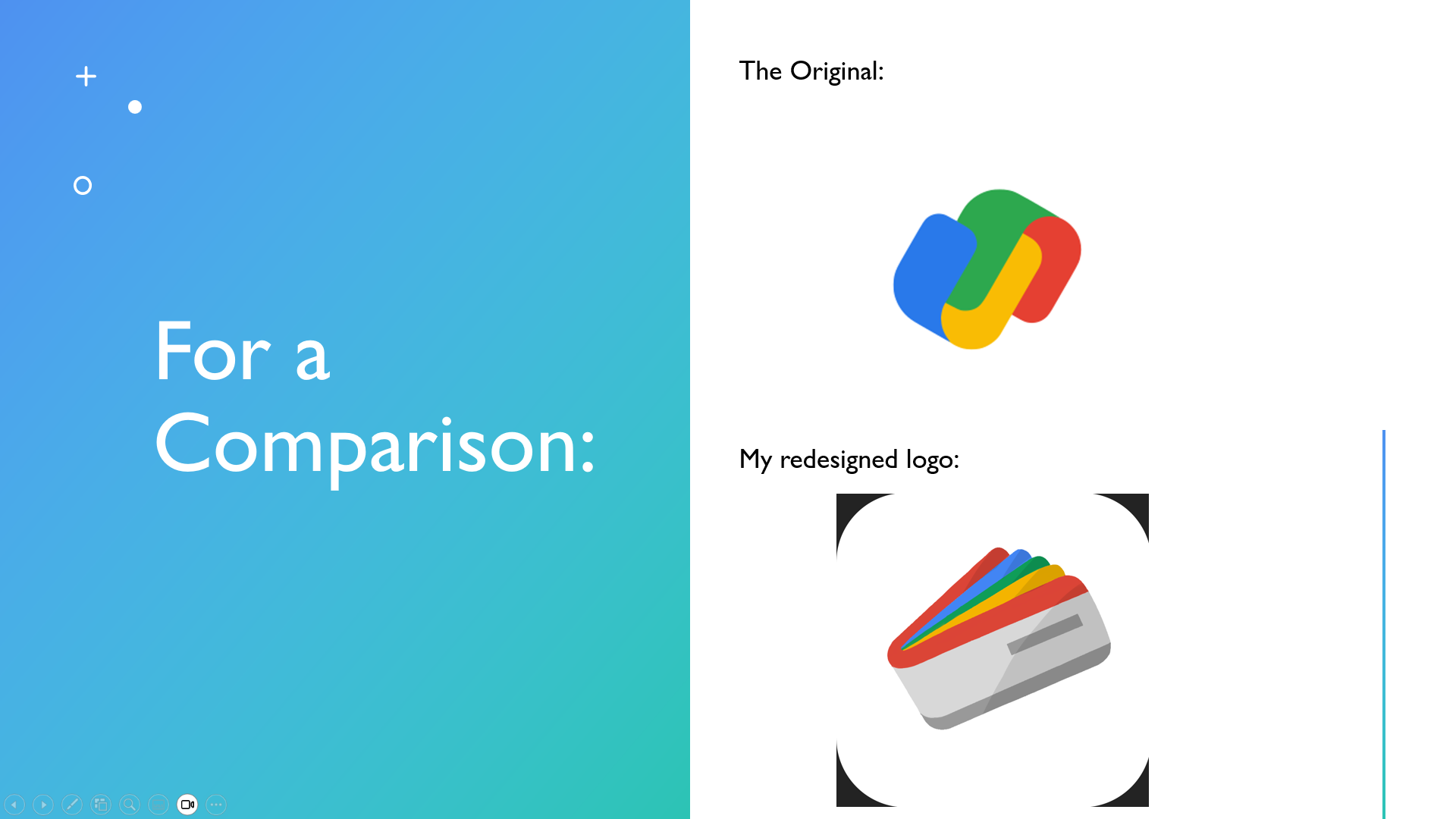 The wallet swivel look and the credit card in the front. I was also really pleased with the grade I received. However, looking back at it I somewhat understood more of the original Google Pay Logo with the Google colours more prominent in them. While my design contained a lot more neutral shades of grey and contained more details with its ‘flaps’, that reduced some of its impact as a ‘Google’ logo. Although my logo did contain less ambiguity on its purpose and meaning, its visual impact has also reduced in exchange.
All in all, this was a fantastic assignment introducing me to Adobe Illustrator and an eye opening experience to how logos are designed and the amount of thought that goes behind them.
Achievements
Grade: AD (Distinction)
